Brand Identity Design, Ads, Packaging
Background: Farassoo Co. was founded in 1991 and specializes in developing and manufacturing computer hardware and software products for both personal and business use. Farassoo wanted to refresh its branding and visual design to better reflect its focus on innovation and quality. The company hired me for a year to create a new visual identity that would appeal to its target audience.
Objective: One of Farassoo Co.’s biggest challenges was staying ahead of the competition in a rapidly changing tech industry. In order to do this, one of the things the company did was hire me to review their existing branding to identify areas for improvement and renovation.
Process: I was given the opportunity to collaborate with Frassoo as their graphic designer and branding consultant. I visited the main, large tech shopping centers to gather information on what type of visual design and branding is available on the market so that I could understand the current trend. I also asked Farassoo’s research team to hand me the list of best-selling brands on the market. Based on the information that I had gathered I redesigned some parts of the company’s brand guidelines and visual identity.
I created a new visual identity that was modern, clean, and professional. The new color palette and visual design style for the entire brand featured a high-quality design that conveyed a sense of reliability and professionalism, while the color palette of blue, black, and dark grey conveyed the company's focus on innovation and speed. I couldn’t find a single tech company in Iran that used the black color as one of their main colors and I didn’t want to just blindly follow the trend. Instead, I wanted to take the visual design to the next level and make it unique.
In addition to the new visual identity, I also developed brand guidelines that outlined how the new branding should be used and provided examples of how it could be applied to different materials and formats. This ensured that the brand was used consistently, and helped maintain its integrity over time.
Results: The new branding was applied across all of Farassoo Co.’s marketing materials, from the company's product packaging to its social billboards and advertising. This helped create a consistent look and feel for the brand and reinforced its positioning in the market.
Conclusion: Overall, the new branding was a success, Farassoo Co. was pleased with the results, with a 33% rise in their sales, and customers and industry experts praising the new visual identity.
This is a backlit poster for a POS device. A point-of-sale (POS) terminal is a hardware system for processing credit card payments at retail locations. I began by using my iPhone 5 to take a picture, then opened it in Adobe Photoshop, cropped the background and replaced it with a higher resolution background. Then, I edited the POS image by using Photoshop and placed it to the right spots by using several tools within Photoshop to sharpen the image, removed the flaws, changed the contrast, edited the light and colors in both the background the POS device accordingly. The poster was printed and placed in several places (such as the elevator) in different sizes. The largest one was printed in 78.8″ x 67" as a backlit poster at the company’s main office.
The process of editing and retouching
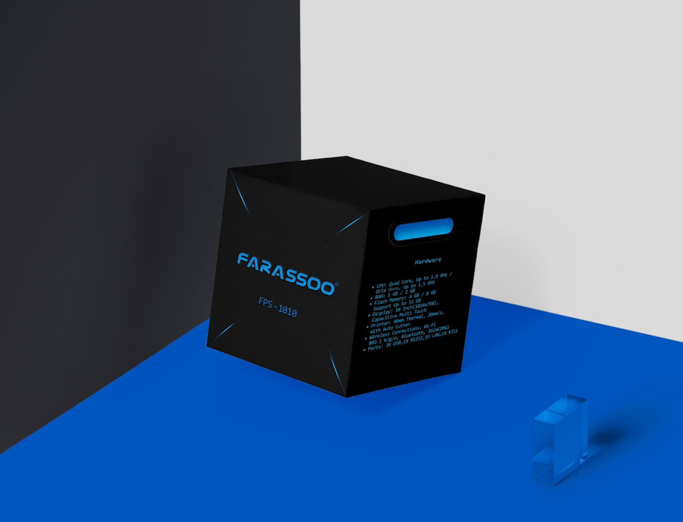
This one is one of many packaging designs I’ve done for Farassoo, which belongs to the POS device. I used blue which was already in Farassoo’s color palette, and added the blue flash lights to the package while completely changing the composition, style, and aspects’ typeface to reach my goal of having a futuristic and modern style.


